front- as it came folded in the post
reverse
This is the edition of Spy that gave its name to the retrospective exhibition and catalogue organised by John’s widow and designed by Mark Harris and Rory Snookes.
Just another WordPress.com weblog
I have always had a drift towards caricature in the way I drew. At Spitting Image we caricaturists would debate, in the occasional quiet moment, whether you could teach someone to caricature or whether it was an innate way of seeing the world. I incline to the latter view. I was always- naturally it seemed- caricaturing anyone I drew from life. I didn’t consider myself a caricaturist then, I was just drawing what I saw.
When I got into Foundation my tutor John Baum spotted this tendency in my work and introduced me to the work of Jack Levine, in particular his paintings of gangsters.

Gangster Funeral 1952-3
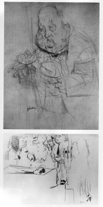
studies for Gangster Funeral
Levine was born in 1915, in the rough part of Boston, Mass. He encountered a world of poverty, immigrants and bootleggers that would shape his politics and his work. At 20 he was hired then fired from the Federal Art Project because he was still living at home. Nevertheless the paintings he produced satirising Boston political life were huge successes.
Welcome Home, a satirical painting made on his discharge from the army later led him to be subpoenaed by the House Un-American Activities Committee for supposed communist sympathies. But he was in Spain at the time and didn’t bother to attend.
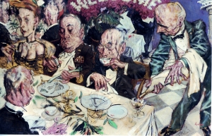
Welcome Home 1946
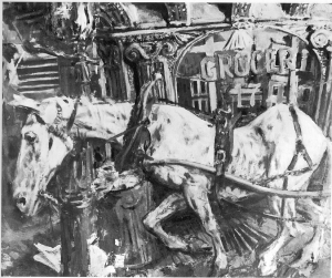
The White Horse 1946
A trip in 1951 around Europe studying Old Masters resulted in his being influenced in particular by El Greco. Returning to the US he added biblical themes and explorations of his own Jewishness to the gangster and political themes he explored in his work.

King Saul 1952
He is still alive and apparently still painting.
Please click on the thumbnails below to see larger images.
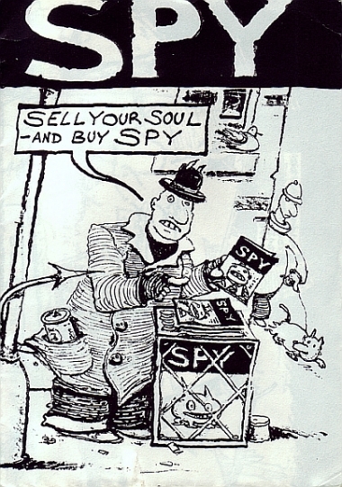
front cover

back cover

half fold out centre
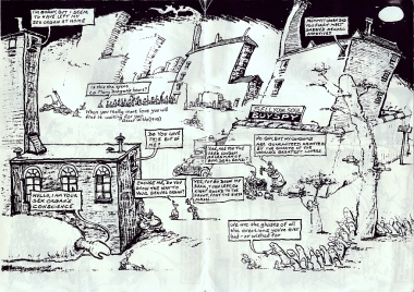
full fold out centre
Most illustrators crave a wide audience and feel that the larger the number of people who see- and appreciate- their work, the better. Usage fees often depend on the number of eyeballs (to use a web term) that land on their reproduced artwork. More eyeballs equals more money.
The idea that your illustrative light should be placed under a self-imposed bushel is an anathema to most illustrators. Lenny Bruce was, I think, right: all artists are saying “Look at me, Ma!”
Spare a thought then for Jacques Kapralik. Although this quirky caricaturist (born- like Steinberg and François- in Romania) worked from the 30s to the 50s for film studios like Paramount, 20th Century Fox and MGM when they were at the height of their powers, most of his work was only seen within the trade, not on the public hoardings that advertised the films these studios made. Inside the movie world he was regarded as a genius; outside it was a different story.
His work is carefully crafted (with the emphasis on craft) and simply, but sharply observed. He used collages made of wool, plastic, fabrics, various kinds of printed papers and sundry found items to generate his clean, precise caricatures. The artwork is always in colour, even if the films being promoted aren’t.
I presume he was well paid, but I wonder if the person who photographed his work was paid more or less than he was…One of the reasons Roger Law and Peter Fluck gave up doing illustrative three dimensional caricatures and started their television puppet show Spitting Image was that the person who photographed their plasticine creations for reproduction (the talented John Lawrence Jones) was paid more than they were for creating the monsters…Perhaps Hollywood was different….?
Oooh, look. Is that a pig flying by the window?

Honky Tonk, MGM, 1941 (Clark Gable and Lana Turner)
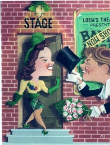
Babes on Broadway, MGM, 1941 (Judy Garland and Mickey Rooney. The latter is not to be confused with Macaroni, a kind of pasta dish)
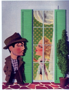
Johnny Eager, MGM, 1942 (Robert Taylor and Lana Turner)

Rio Rita, MGM, 1942 (Bud Abbott and Lou Costello)

Random Harvest, MGM, 1942 (Ronald Colman and Greer Garson)

I Married An Angel, MGM, 1942 (Nelson Eddy and Jeanette MacDonald)

Woman of the Year, MGM, 1942 (Katharine Hepburn and Spencer Tracy)

Keep Your Powder Dry, MGM, 1945 (Susan Peters, Laraine Day, Lana Turner)
As ever, with this new ‘improved’ WordPress format, you have to click on the images below to see a bigger version of the illustration!
As a colour blind art student I had to get my mother to help me with colours until I left home. Then, initially, I relied on my peers until one fateful life painting class where I asked the person next to me to mix some flesh tones for me while the tutor was out of the room. On his return my tutor asked why I was painting the model’s skin purple. The room was suddenly full of repressed sniggers….
I stuck to black and white after that. I had kept my colour blindness a secret from the staff at Liverpool Art School as I had been informed they didn’t take people with my problem. It was the angry, punky 1970s so a black and white scratchy pen portfolio was right there, deep in the Zeitgeist. But at the end of the second year we had a show of all of our work. The senior tutor (the late John Roberts, an expert on hand drawing as he constantly demonstrated on my life drawings- on them!) asked me to accompany him around this show.
He started off by telling me that there was something odd about the show. I looked at all of the work. Every image was in colour, except for mine. We walked up and down for a while in silence, examining all of the work. Eventually we came to a dead stop right in front of my work. He turned to me. “You know what’s wrong?” he asked. “No” I replied quietly. “No one else is using the power of black and white, apart from you. We must get the others thinking more about the power of black and white.” And off he went to talk to the other staff.
I don’t know if it is my visual problem that means I am more often swayed by black and white work than that in colour. My Foundation tutor (John Baum, the Welsh answer to Omar Sharif) told me I had a ‘graphic eye’, which I put down to drawing with a 6B pencil (I use an EE now. Very mucky). I just like the boldness of black and white work in the same way (I guess) that some people prefer black and white photography to colour photography. It’s more immediate, but has a smaller visual range (although it may have a larger range of marks). It is the visual equivalent of radio- you do a lot of the work in your own imagination. And reality is no match for the imagination.
Unless you work in advertising. When I first represented the wood engraver Chris Wormell art directors were always wanting him to add colour. “What for?” I used to ask. “Because this page is going to be in colour” was their usual reply. “But his work is powerful enough as it is” was my standard riposte. “We’ve got four colour printing here and so we want it in colour” was always their final word.
Colour printing is now so cheap that everything has to be in colour whether or not it ought to be. The Radio Times dropped colour just before or during World War 2: it was sometime in the 1960s (I think) before they reintroduced it. That black and white period was the Golden Age of illustration in the magazine. Black and white work is now generally disregarded and the talented illustrators who used to be so well-employed in the days when colour was too expensive for everyday use are now neglected.
Let’s put that right! Here are some examples of work by the forgotten illustrators who usually appeared only in black and white. True, some are less forgotten than others (the wood engravers tend to have their own supporters) but they all need a little remembering and a little congratulation for the skill they displayed.
WordPress have changed all the back room stuff that makes this blog function and I am having a few problems with image links. For now I have posted non-active images directly below, with credits. Below these is a gallery that can be clicked on to take you to a larger image. Sorry for the roundabout journey, but I am sure you’ll find it worth it!

John Austen (British) : illustration for Byron’s Don Juan

Charles-Emile Carlègle (French) : illustration for Les Plus Jolies Roses de l’Anthologie Grecque

Stanislaw Ostoja-Chrostowski (Polish) : The Wood
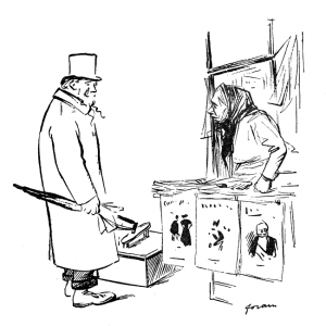
Jean-Louis Forain (French) : illustration from Doux Pays
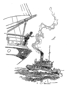
Gordon Grant (American) : illustration from Sail Ho!

Keith Henderson (British) : illustration for Green Mansions

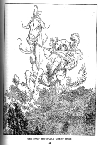
W. Heath Robinson (British) : illustrations for Gargantua and Pantagruel
I know that WHR is not a negected illustrator, thanks to his bizarre drawings of convoluted mechanisms; but few people know his earlier black and white illustrations.
Apologies for the quality of the scans but the book, for those of you who don’t know it, is very thick and this copy is rather old (1931), hence the letterpress showing through the paper. If you haven’t read it I strongly recommend it!

Peter Staronossov (Russian) : illustration for Tales From The North
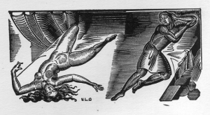
Valentin le Campion (French) : illustration for Les Poésies Priapiques

Norman Lindsay (Australian) : illustration for Lysistrata
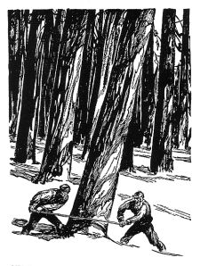
Henry C. Pitz (American) : illustration for Lumberjack

Michael Poliakov (Russian) : illustration for Germania

Edmund J. Sullivan (British) : illustration for The Rubaiyat of Omar Khayyam

C.W. Taylor (British) : illustration for LNER poster for East Anglia

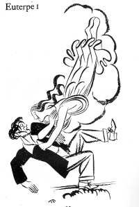
Thomas Derrick (British) : two illustrations from his book The Muses
I have written about Derrick’s work in the AOI magazine (see link for Writings on Illustration/ neglected illustrators) but if you visit their archive they have (peculiarly) not kept the images.

P.E. Vibert (French) : Nude
This is just a small selection of the many people I could have included. There are a number of absences. The wood engravers Clare Leighton, Blair Hughes-Stanton, Gwen Raverat and Agnes Miller-Parker are excluded due to the poor quality of reproduction of the old images I have of theirs- they don’t scan well. The same is true of the work I have of Auguste Lepère (although I am sure I have some good clean prints somewhere). One notable absence for me personally is Herbert Railton, the flamboyant Victorian architectural illustrator. I will see what I can do about rectifying this.
front cover
back cover
centre spread
quarter fold-out back cover
half fold-out back cover
My favourite image in this issue of Spy is the Mhairi Macaroon illustration. It’s so seedy and cheesy, and so beautifully done. Redolent of some war-time cabaret, it was probably created mostly with John’s trusty Berol RollerBall pen. He could make that little bit of shitty plastic sing!
This lovely illustration is from Animal Frolics (Thomas Nelson & Sons, 1937?). It goes with a short poem (The Nightmare) about the dangers of being greedy and feasting on strawberry jam and toasted cheese just before retiring. I think it is the best illustration in the book. The book has a selection of poems about animals with illustrations by a number of artists. I liked this one anyway, partly because it has humorous associations for me with the rather frightening Mervyn Peake illustration from “Ride a Cock-Horse” which is also meant to be for children (!). But it wasn’t until I scanned it in and realised there was a signature in the top right hand corner that I got a bit more interested in it.
It appears (younger readers please correct my faltering eyesight) to be signed by Alfred Leete. Who he? He is the self taught illustrator who provided the British with one of the most iconic and oft repeated/imitated images: that of Lord Kitchener declaiming “Your Country Wants You” (originally published on the cover of the magazine London Opinion and later amended and used as a poster in World War 1). He is the James Montgomery Flagg of Britain. Except that most of Leete’s later work was humorous.
Leete
Peake
Most illustrations I know by Ernest Wallcousins are paintings of North American landscapes. As a colour blind illustrator I probably don’t get quite as much out of that branch of his work as I do out of this. It is quite different in feel to his colour work (which is quite romantic) but I love the way in which he handles lines in this illustration. The use of regular parallel lines to describe the planes of the architectural forms balances neatly with the stripes on the gent’s trousers (an example of ‘control and release’) and with the careful use of solid black. It is from The Big Book of Great Short Stories (Odhams, 1935) and is an illustration for The Tremendous Adventures of Major Brown by G.K Chesterton.
Another fine illustrator not mentioned much these days is H.M Brock, even though he only died about fifty years ago (O Tempo!). He produced a huge range of illustrations (mostly black and white) for novels but my personal favourites are the series of images he did showing how the use of electricity would have changed history. I have the complete set of twelve but they are framed and I am loathe to get them out to scan or photograph. Here is a link to reproductions of four of them:
http://www.carolenoakes.co.uk/histro%20electric%20pictures.htm
You can also find information about H.M Brock and his brother, C.E. Brock- also an illustrator- here in wordpress:
and here at another blog site:
http://buttes-chaumont.blogspot.com/2007/07/h-m-brock-1875-1960.html
which belongs to Phil Beard, another fan of illustration.