I still prefer William Hartnell…
david-tennant-caricature-image
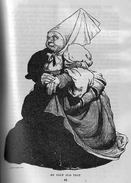
dr-who-caricature-image
david-tennant-as-dr-who-caricature-image
Just another WordPress.com weblog
I still prefer William Hartnell…
david-tennant-caricature-image
dr-who-caricature-image
david-tennant-as-dr-who-caricature-image


can he nuke us? yes he can!…if he’s still alive….

If not Bibi, then Tzipi? Crazy names, crazy guys…
This is my first drawing of Tzipi. When I was hired by Spitting Image it was under the illusion that I was ace at caricaturing women- unlike most caricaturists. I soon corrected their misunderstanding by doing a deathly drawing of Madonna (then in her ‘Like a Virgin’ phase) mostly because I was caricaturing the (very heavy) make up rather than the bone structure underneath. The make up- as it was designed to do- defeated my eyes and my brain…


this magazine was so great to work for- full illustrated covers almost every week…

ES cover for sexism in the city of London

spring in London- no tourist trip was complete without a visit to the Kings Road ‘punks’

cover of The Guardian g2 supplement


front cover

back cover

half fold out centre

full fold out centre


As a colour blind art student I had to get my mother to help me with colours until I left home. Then, initially, I relied on my peers until one fateful life painting class where I asked the person next to me to mix some flesh tones for me while the tutor was out of the room. On his return my tutor asked why I was painting the model’s skin purple. The room was suddenly full of repressed sniggers….
I stuck to black and white after that. I had kept my colour blindness a secret from the staff at Liverpool Art School as I had been informed they didn’t take people with my problem. It was the angry, punky 1970s so a black and white scratchy pen portfolio was right there, deep in the Zeitgeist. But at the end of the second year we had a show of all of our work. The senior tutor (the late John Roberts, an expert on hand drawing as he constantly demonstrated on my life drawings- on them!) asked me to accompany him around this show.
He started off by telling me that there was something odd about the show. I looked at all of the work. Every image was in colour, except for mine. We walked up and down for a while in silence, examining all of the work. Eventually we came to a dead stop right in front of my work. He turned to me. “You know what’s wrong?” he asked. “No” I replied quietly. “No one else is using the power of black and white, apart from you. We must get the others thinking more about the power of black and white.” And off he went to talk to the other staff.
I don’t know if it is my visual problem that means I am more often swayed by black and white work than that in colour. My Foundation tutor (John Baum, the Welsh answer to Omar Sharif) told me I had a ‘graphic eye’, which I put down to drawing with a 6B pencil (I use an EE now. Very mucky). I just like the boldness of black and white work in the same way (I guess) that some people prefer black and white photography to colour photography. It’s more immediate, but has a smaller visual range (although it may have a larger range of marks). It is the visual equivalent of radio- you do a lot of the work in your own imagination. And reality is no match for the imagination.
Unless you work in advertising. When I first represented the wood engraver Chris Wormell art directors were always wanting him to add colour. “What for?” I used to ask. “Because this page is going to be in colour” was their usual reply. “But his work is powerful enough as it is” was my standard riposte. “We’ve got four colour printing here and so we want it in colour” was always their final word.
Colour printing is now so cheap that everything has to be in colour whether or not it ought to be. The Radio Times dropped colour just before or during World War 2: it was sometime in the 1960s (I think) before they reintroduced it. That black and white period was the Golden Age of illustration in the magazine. Black and white work is now generally disregarded and the talented illustrators who used to be so well-employed in the days when colour was too expensive for everyday use are now neglected.
Let’s put that right! Here are some examples of work by the forgotten illustrators who usually appeared only in black and white. True, some are less forgotten than others (the wood engravers tend to have their own supporters) but they all need a little remembering and a little congratulation for the skill they displayed.
WordPress have changed all the back room stuff that makes this blog function and I am having a few problems with image links. For now I have posted non-active images directly below, with credits. Below these is a gallery that can be clicked on to take you to a larger image. Sorry for the roundabout journey, but I am sure you’ll find it worth it!

John Austen (British) : illustration for Byron’s Don Juan

Charles-Emile Carlègle (French) : illustration for Les Plus Jolies Roses de l’Anthologie Grecque

Stanislaw Ostoja-Chrostowski (Polish) : The Wood

Jean-Louis Forain (French) : illustration from Doux Pays

Gordon Grant (American) : illustration from Sail Ho!

Keith Henderson (British) : illustration for Green Mansions


W. Heath Robinson (British) : illustrations for Gargantua and Pantagruel
I know that WHR is not a negected illustrator, thanks to his bizarre drawings of convoluted mechanisms; but few people know his earlier black and white illustrations.
Apologies for the quality of the scans but the book, for those of you who don’t know it, is very thick and this copy is rather old (1931), hence the letterpress showing through the paper. If you haven’t read it I strongly recommend it!

Peter Staronossov (Russian) : illustration for Tales From The North

Valentin le Campion (French) : illustration for Les Poésies Priapiques

Norman Lindsay (Australian) : illustration for Lysistrata

Henry C. Pitz (American) : illustration for Lumberjack

Michael Poliakov (Russian) : illustration for Germania

Edmund J. Sullivan (British) : illustration for The Rubaiyat of Omar Khayyam

C.W. Taylor (British) : illustration for LNER poster for East Anglia


Thomas Derrick (British) : two illustrations from his book The Muses
I have written about Derrick’s work in the AOI magazine (see link for Writings on Illustration/ neglected illustrators) but if you visit their archive they have (peculiarly) not kept the images.

P.E. Vibert (French) : Nude
This is just a small selection of the many people I could have included. There are a number of absences. The wood engravers Clare Leighton, Blair Hughes-Stanton, Gwen Raverat and Agnes Miller-Parker are excluded due to the poor quality of reproduction of the old images I have of theirs- they don’t scan well. The same is true of the work I have of Auguste Lepère (although I am sure I have some good clean prints somewhere). One notable absence for me personally is Herbert Railton, the flamboyant Victorian architectural illustrator. I will see what I can do about rectifying this.